next up previous contents index
Next: 8.11 Example: range analysis Up: 8 Graphs Previous: 8.9 Printing your graph

8.10 Range Analysis

The steps to performing range analysis are described below:

  1. Be sure that you have a properly defined schema. If you want to perform date range analysis, then your schema must contain a field that has the keywords ``type date''. If you want to perform a numeric range analysis, then you must have a field that contains either ``type integer'' or ``type real''.
  2. From the graph/barchart setup window, select the X/Y-axis attributes that you want to receive the range analysis. For example, if you want to analyze web hits for 1994 through 1996, you would select your Date attribute for the X-axis and your WebHit attribute for the Y-axis.
  3. Click the ``Range analysis'' checkbutton shown in figure 8.7.

      figure2266
    Figure 8.7: Range analysis checkbutton

    You must have this checkbutton turned on for nxqddb to perform range searching. If this button is turned off, then nxqddb omits any range calculations.

  4. Enter the range and format parameters. If your X-axis attribute is a date field, then nxqddb provides a range/format pull-down menu as shown in figure 8.8. Clicking one of the options

      figure2275
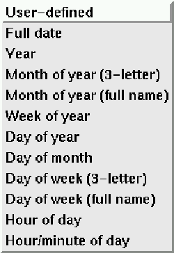
    Figure 8.8: Range/format options for date range analysis

    populates the range and format entry boxes. Of course, if you choose ``User-defined'' value from the pull-down, nxqddb places the cursor in the range entry to allow you to define your own range and format values. Most users will likely opt to use one of the range/format combinations from the listbox. If your X-axis is not a date field, then you must specify a positive integer in the range entry. For attributes defined as real, the integer value you enter in the format field tells nxqddb the precision (i.e. the number of digits to the right of the decimal) of your Y-axis. If the Y-attribute was not typed as integer, then the format field is ignored.

  5. Run your report normally.
  6. After your report has run, you can quickly modify your range/format settings and ``Apply'' your updates instantly while the graph is still displayed. Qddb is able to quickly display new ranges and formats because of the way it generates intermediate data. The details of how Qddb does this data management is beyond the scope of this text; however, you can appreciate the speed of these graph updates. For example, earlier we mentioned looking at say, web hits for 1994-1996. You can quickly analyze the data over several views such as monthly, yearly or even look at what the hits were on each day of the week. Of course, you can look at the sum, average, or any of the other operations available from the pull-down menu.

next up previous contents index
Next: 8.11 Example: range analysis Up: 8 Graphs Previous: 8.9 Printing your graph

Herrin Software Development, Inc.